

Typography in Modern Marketing: Elegant Meets Approachable
Thoughtful font pairings can instantly elevate a brand’s personality while enhancing readability across every platform.
In today’s crowded digital landscape, brands must communicate personality, credibility, and approachability at a glance. Typography is one of the most subtle yet powerful tools for doing this. A carefully chosen font conveys emotion, builds trust, and helps define a brand’s visual identity – often before a reader even reads the first word.
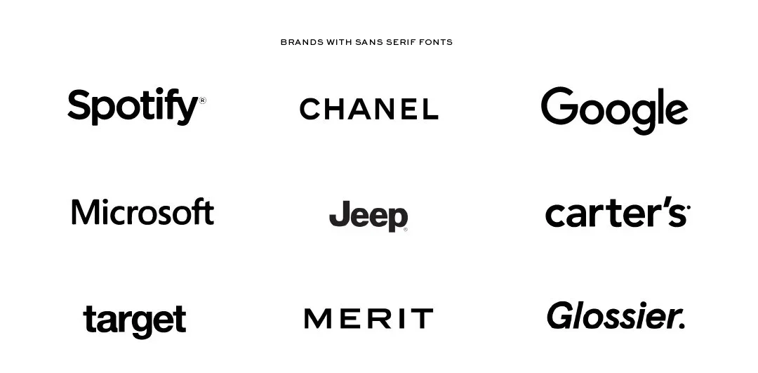
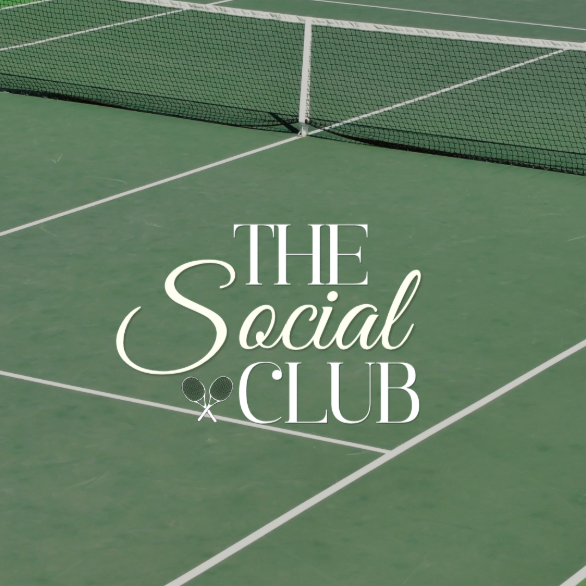
Modern marketing increasingly pairs serif fonts with handwritten or script fonts to signal elegance while retaining a human touch. For longer content or digital copy, rounded sans-serif fonts are favoured for their readability and friendly feel. This combination creates a cohesive, multi-layered typographic strategy that resonates with audiences and reinforces brand messaging across every channel.

THE RISE OF SERIF FONTS FOR ELEGANCE
Serif fonts have a long-standing association with tradition, authority, and sophistication. The small “feet” or strokes at the ends of letters add a visual flourish that can make type feel grounded and established. Historically, serifs were often used in books and newspapers, which is why they are perceived as more formal and credible. Today, marketers are embracing both traditional and modern serif styles to communicate elegance without feeling outdated or rigid.
Why serif fonts work:
Authority: They convey expertise and trustworthiness, making them perfect for premium products or professional services.
Versatility: Modern serifs can feel fresh and contemporary when paired with complementary fonts.
Visual hierarchy: Their distinctive shapes make them ideal for headers, helping content stand out.
However, it’s important to use serif fonts strategically. Overusing ornate or complex serifs in long paragraphs can reduce readability, especially on digital screens. The best practice is to reserve them for headers, taglines, or brand logos, allowing other fonts to handle body text. For example, a luxury skincare brand might use a classic serif font for product names, paired with a clean, readable sans-serif for descriptions and ingredient lists.
HANDWRITTEN & SCRIPT FONTS: ADDING PERSONALITY
Handwritten and script fonts bring a human, relatable touch to brand messaging. They evoke warmth, creativity, and individuality, which can be especially powerful in an age of automated marketing and templated content. When used correctly, these fonts signal that a brand is approachable, personal, and attuned to its audience.
When to use handwritten or script fonts:
Highlighting slogans, taglines, or product names
Adding flair to packaging or promotional materials
Creating a sense of authenticity in social media posts
These fonts shine when they complement, rather than overwhelm, the overall design. For instance, a boutique coffee brand might use a flowing script font to emphasize the handwritten quality of a “small batch” product line, while keeping the body text clean and simple. The contrast between elegant serifs and playful script can make the design feel layered and intentional.
Key considerations:
Legibility: Ensure that cursive or handwritten fonts are easy to read, especially at smaller sizes.
Consistency: Use scripts selectively for emphasis to avoid visual clutter.
Emotion: The font’s personality should match the brand’s tone, quirky scripts for playful brands, and elegant scripts for premium brands.

Serif font verus cursive font.
BUILDING A COHESIVE BRAND NARRATIVE WITH FONTS
Effective typography isn’t just about selecting “pretty” fonts; it’s about creating a structured hierarchy that guides the reader and communicates layered meaning. A coherent typographic strategy assigns clear roles to each font type:
Serif for headers: Establishes authority and sophistication.
Script/handwritten for accents: Adds personality and human warmth.
Rounded sans-serif for body text: Ensures readability and approachability.
Consistency is crucial. Using the same font combinations across websites, social media, email campaigns, and packaging strengthens recognition and reinforces a unified brand voice. For instance, a luxury stationery brand might consistently use a serif font for product names, a script for handwritten-style callouts, and a rounded sans-serif for descriptive text across all touchpoints. This creates a visual language that audiences immediately recognize and trust.
WHY TYPOGRAPHY MATTERS BEYOND STYLE
Fonts are not decorative; they are communicative. They influence perception, convey emotion, and establish tone. The right typography makes content feel approachable and credible, even before the reader digests the message. Serif fonts convey expertise and reliability, script fonts convey personality and warmth, and rounded sans-serif fonts convey clarity and accessibility.
Together, these fonts form a typographic hierarchy that not only looks cohesive but also tells a story. A carefully designed combination can make a brand feel expert yet human, polished yet approachable.
To make the most of typography in marketing design, consider these practical tips:
Limit your palette: Stick to 2–3 primary fonts to avoid visual clutter.
Define roles clearly:Decide which fonts are for headers, accents, and body text.
Test readability: Ensure scripts and serif fonts remain legible at different sizes, especially on mobile.
Consider context: Choose fonts that match your audience’s expectations and brand positioning.
Create visual harmony: Pay attention to spacing, sizing, and alignment to maintain balance.
Typography is one of the most strategic tools a brand can use to communicate identity, emotion, and trust. By pairing elegant serif fonts with handwritten or script accents and readable, rounded sans-serif body text, brands can create designs that are simultaneously sophisticated and approachable. The result is not only a visually appealing design but a narrative that resonates with audiences, reinforces trust, and strengthens brand recognition. In an age where attention is scarce and impressions matter, typography can tell a story even before a single word is read.